Scrapbooks for
men and women
As a graphic designer, I was entrusted with the task of designing two print scrapbooks for Filippa K’s Spring/Summer collections—one for women and one for men. The objective was to translate the brand’s minimalist and sophisticated identity into visually engaging print materials.
-
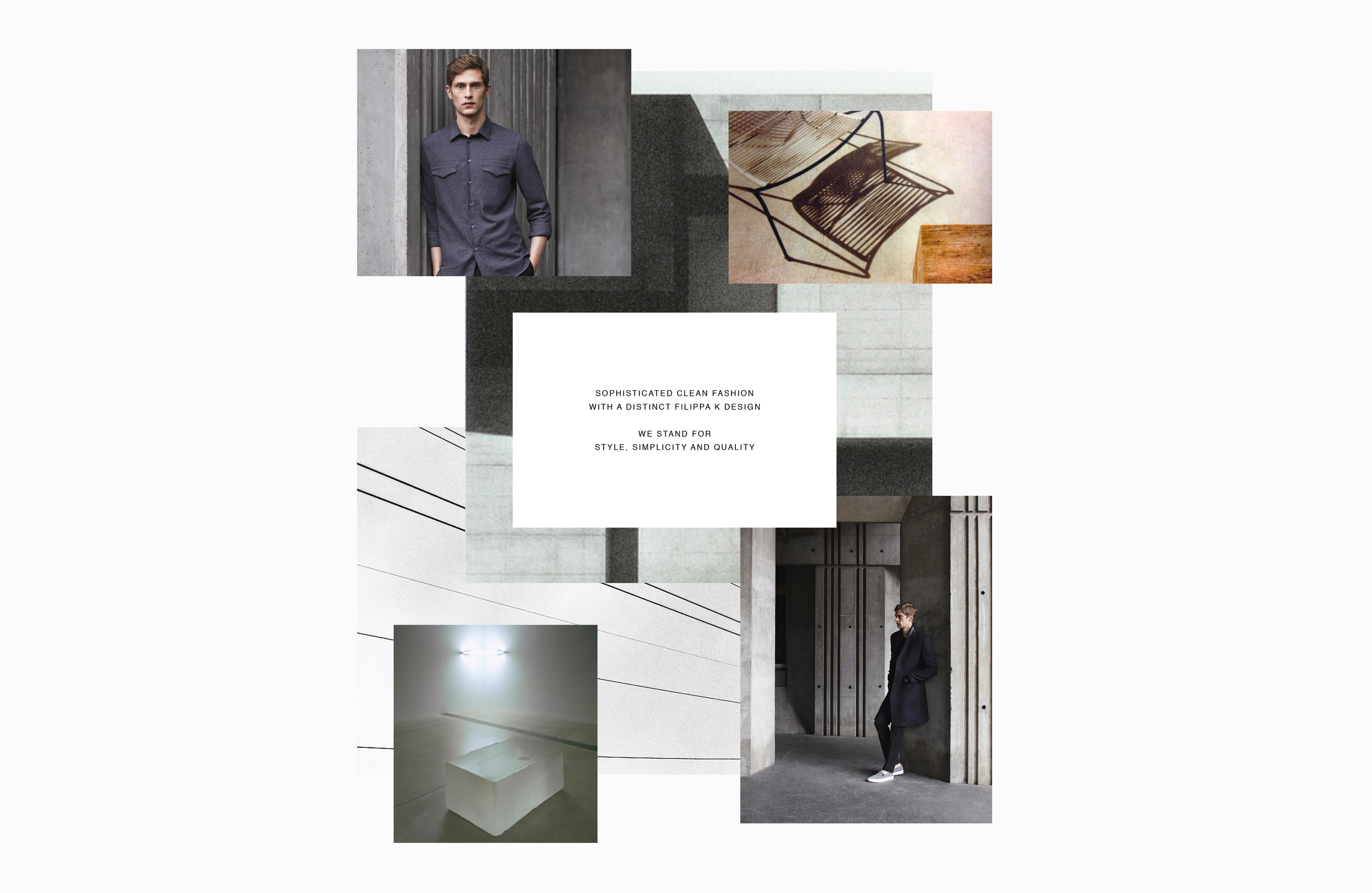
Filippa K’s brand strategy is built around the principles of minimalist design, emphasizing timeless elegance and functionality. The brand is dedicated to creating high-quality, versatile pieces that transcend seasonal trends, offering customers lasting wardrobe staples that can be worn year after year. Filippa K’s focus on effortless style and refined simplicity resonates with a modern, conscious consumer who values both aesthetics and practicality.
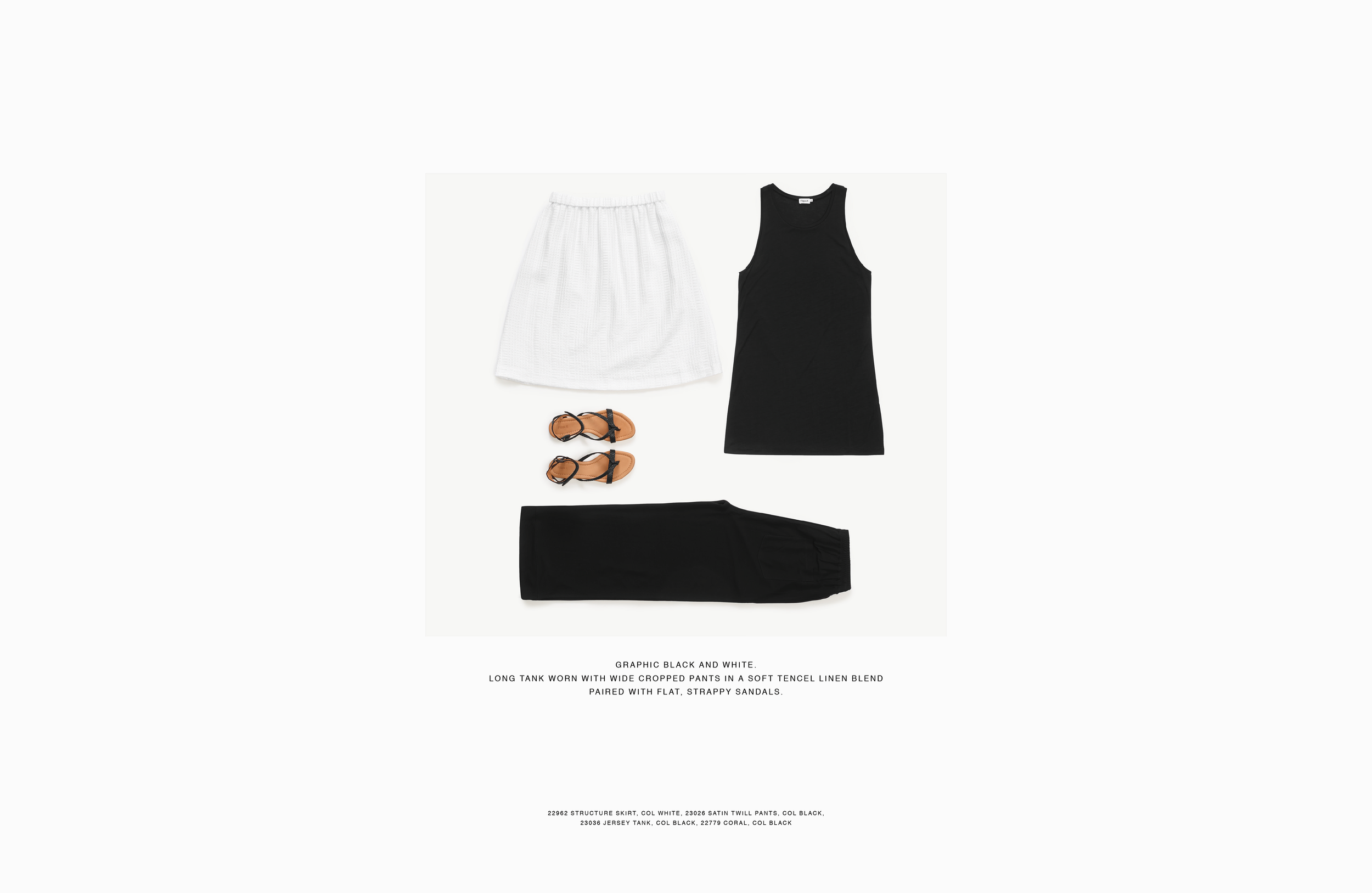
Within this strategy, a Scrapbook serves as a powerful tool to visually communicate the brand’s core values. It not only showcases the collection but also demonstrates how each piece fits into the everyday life of the brand’s target audience. Through carefully curated photography and styling, the lookbook highlights the versatility and enduring appeal of Filippa K’s designs, offering inspiration on how to incorporate them into a modern, minimalist wardrobe. This visual approach strengthens the brand’s identity, helping consumers connect with the style and values that Filippa K represents.
-
When tasked with creating two Scrapbooks—one for women’s and one for men’s Spring/Summer collections, my mission was to visually express the essence of each collection in a print format, staying true to the brand’s identity.
I started by deeply trying to understand the collection’s themes, then carefully selected photography, layouts, typography, and color schemes to ensure a cohesive and engaging narrative. The design had to feel seamless across the pages, guiding the viewer through the collection while highlighting its key pieces.
The goal was to produce Scrapbooks that not only showcased the collections but also captured the spirit of the season and inspired the audience, all while reinforcing the brand’s vision in a tangible, printed format.
-
My role as graphic designer—encompassed the following key responsibilities:
Conceptual Development: Collaborated with the design and marketing teams to define the overarching theme and aesthetic for each collection, ensuring alignment with the brand’s identity and seasonal trends.
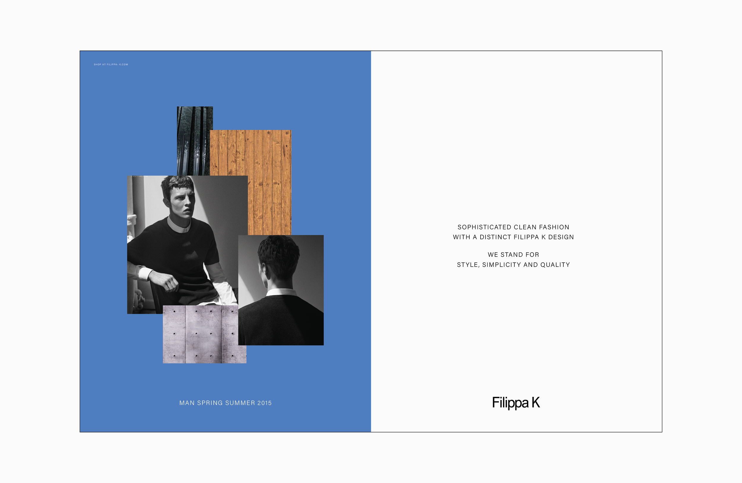
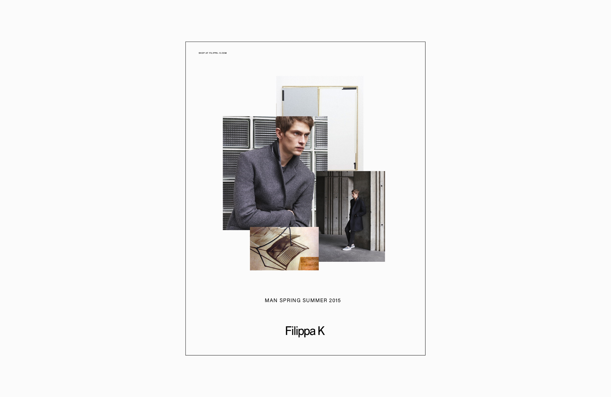
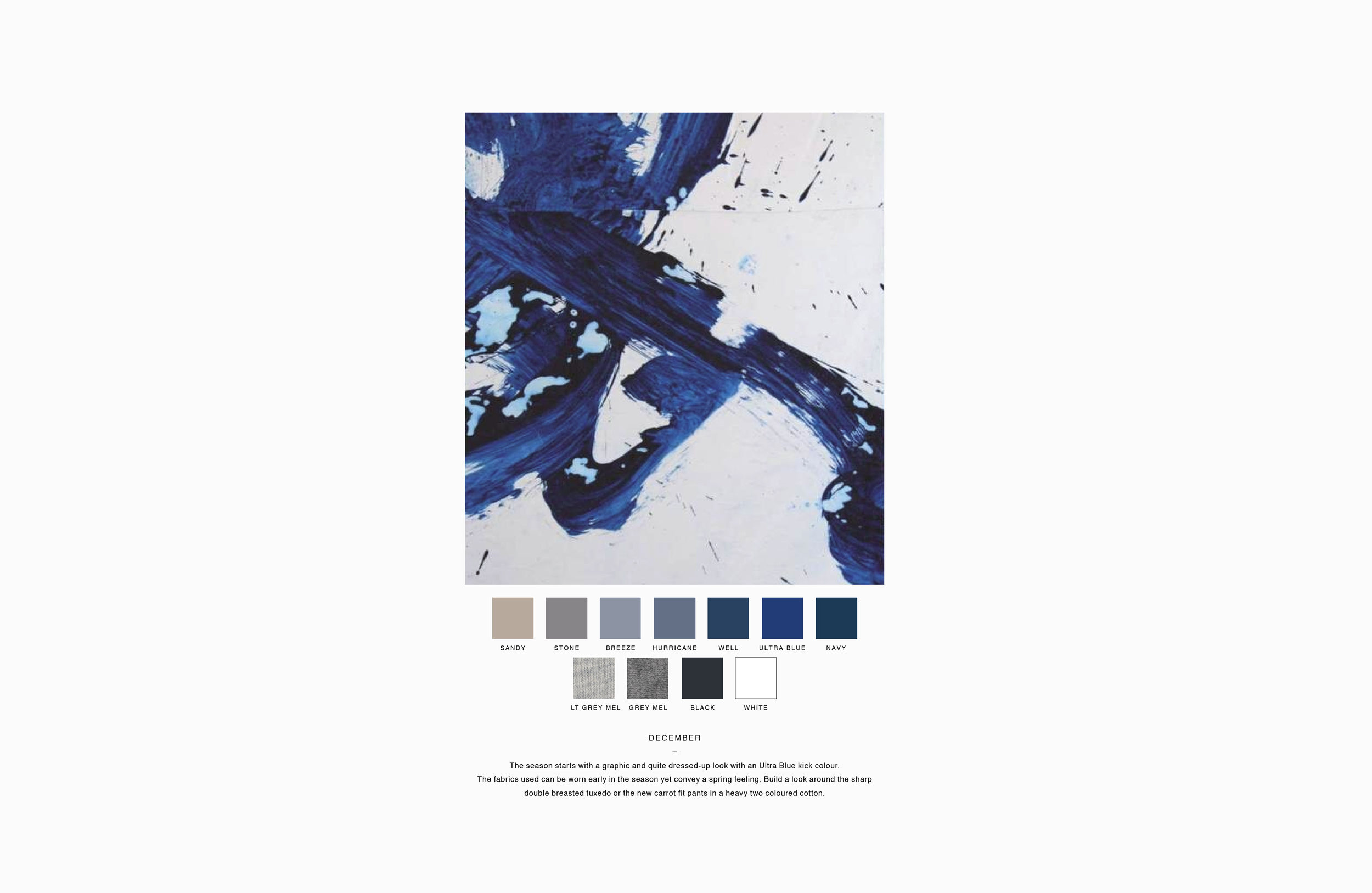
Mood Board Creation: Developed mood boards to visually represent the desired look and feel, incorporating elements such as color palettes, textures, and styling references to guide the design process.
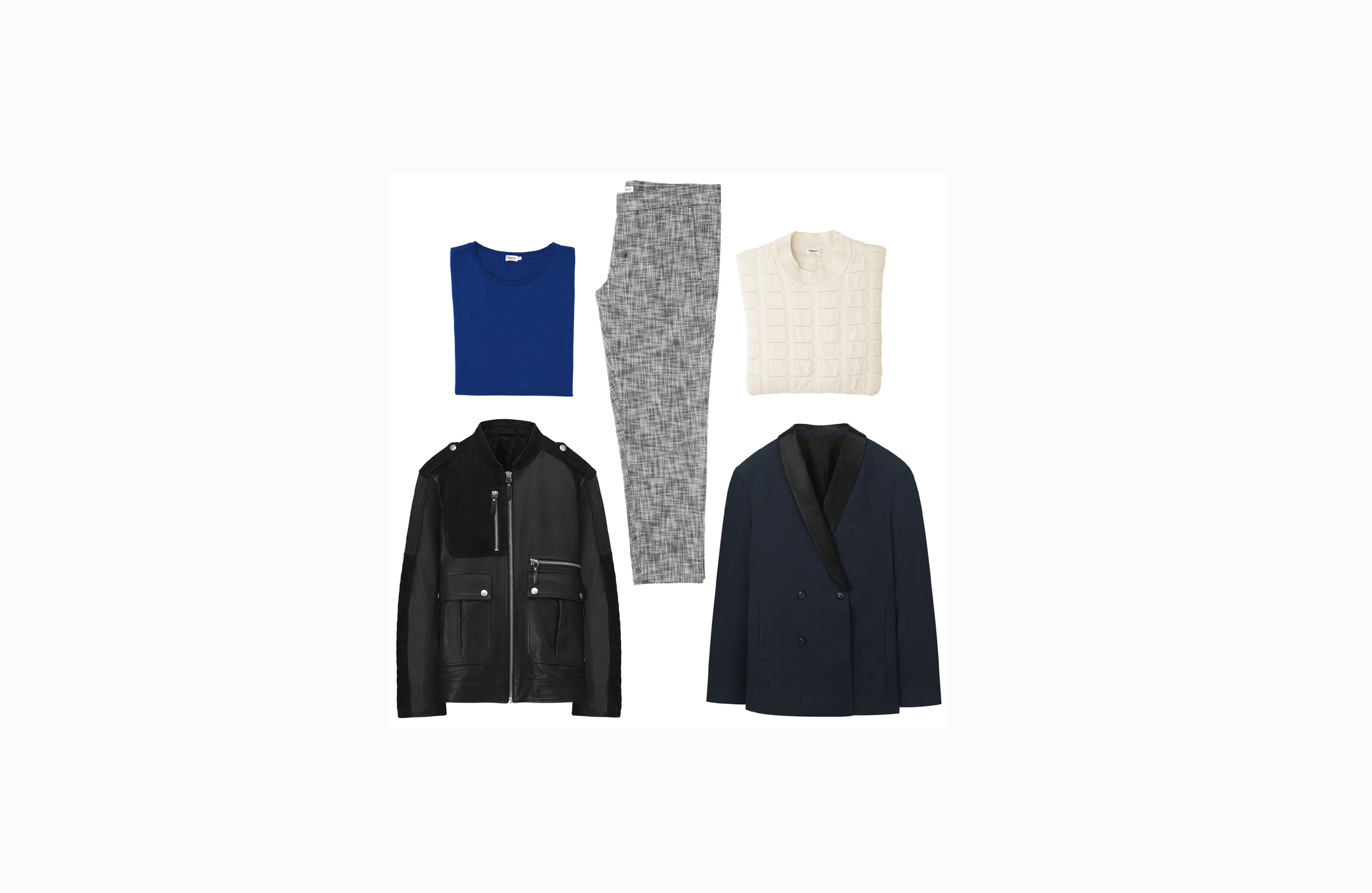
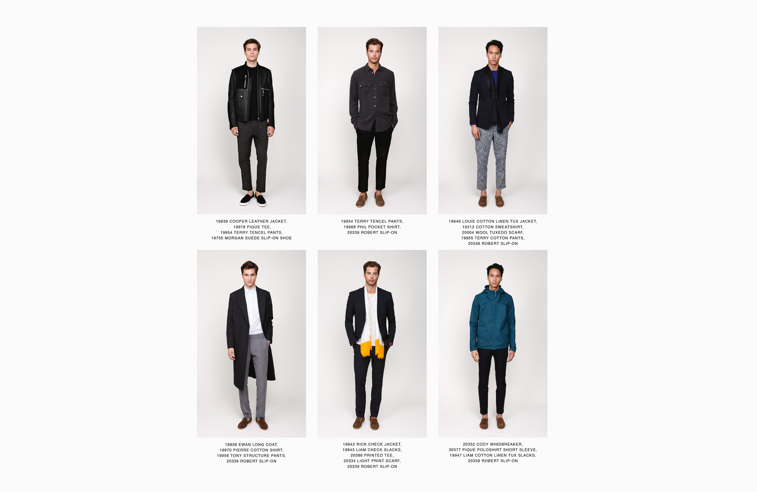
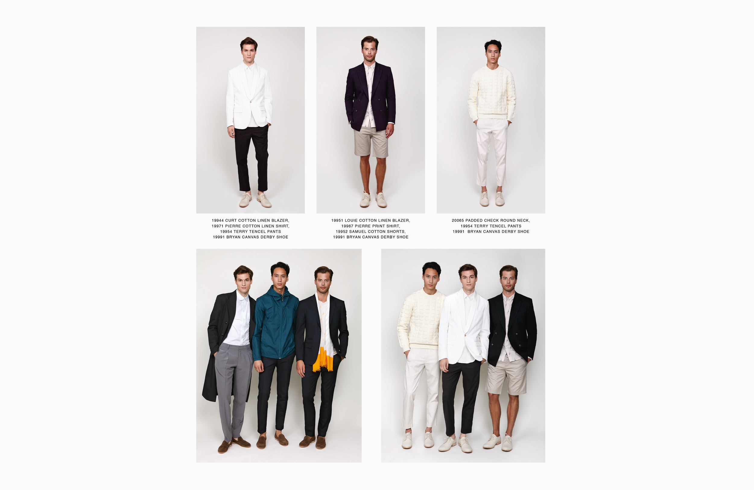
Layout Design: I created clean, structured layouts that showcased the collections effectively, balancing imagery and text to highlight key pieces and styling details.
Typography and Branding: Selected appropriate typography and adhered to brand guidelines to maintain consistency across both Scrapbooks, reinforcing the brand’s visual identity.
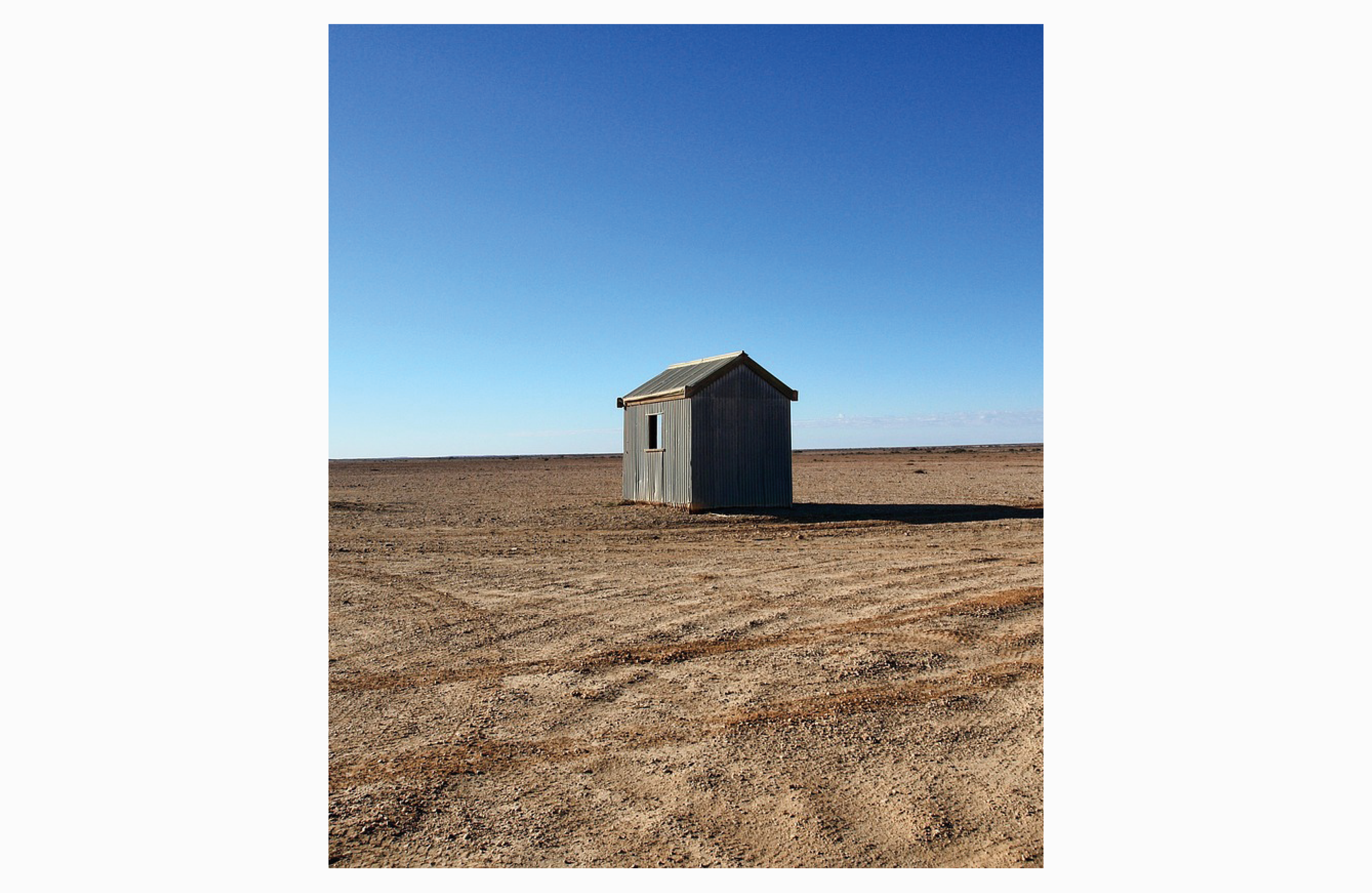
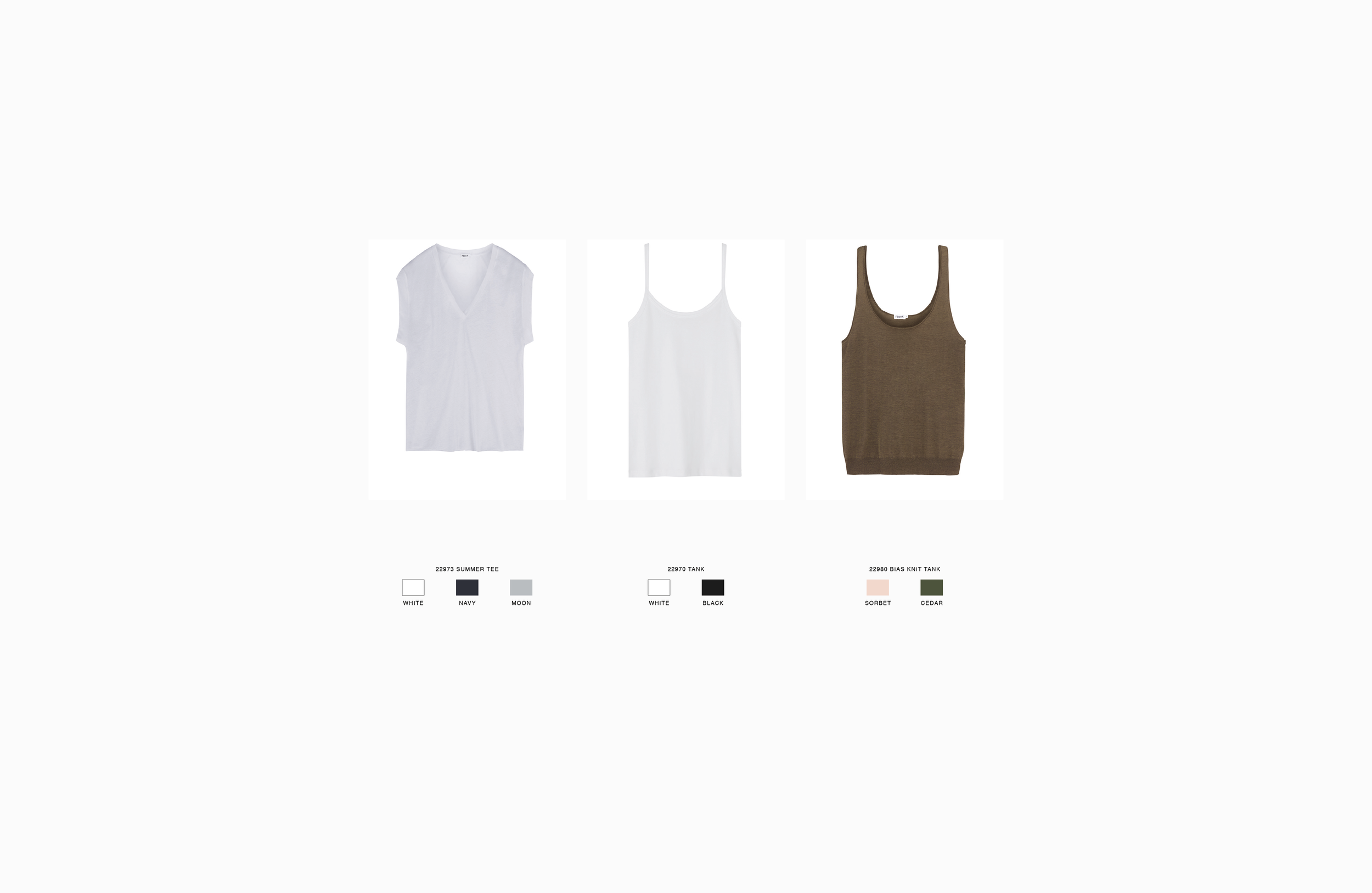
Image Selection and Editing: Worked closely with photographers and stylists to select high-quality images that captured the essence of each collection, ensuring proper editing and retouching for print quality.
Production Coordination: Oversaw the printing process, collaborating with vendors to select paper types, finishes, and binding options that complemented the design and enhanced the tactile experience of the Scrapkbooks.


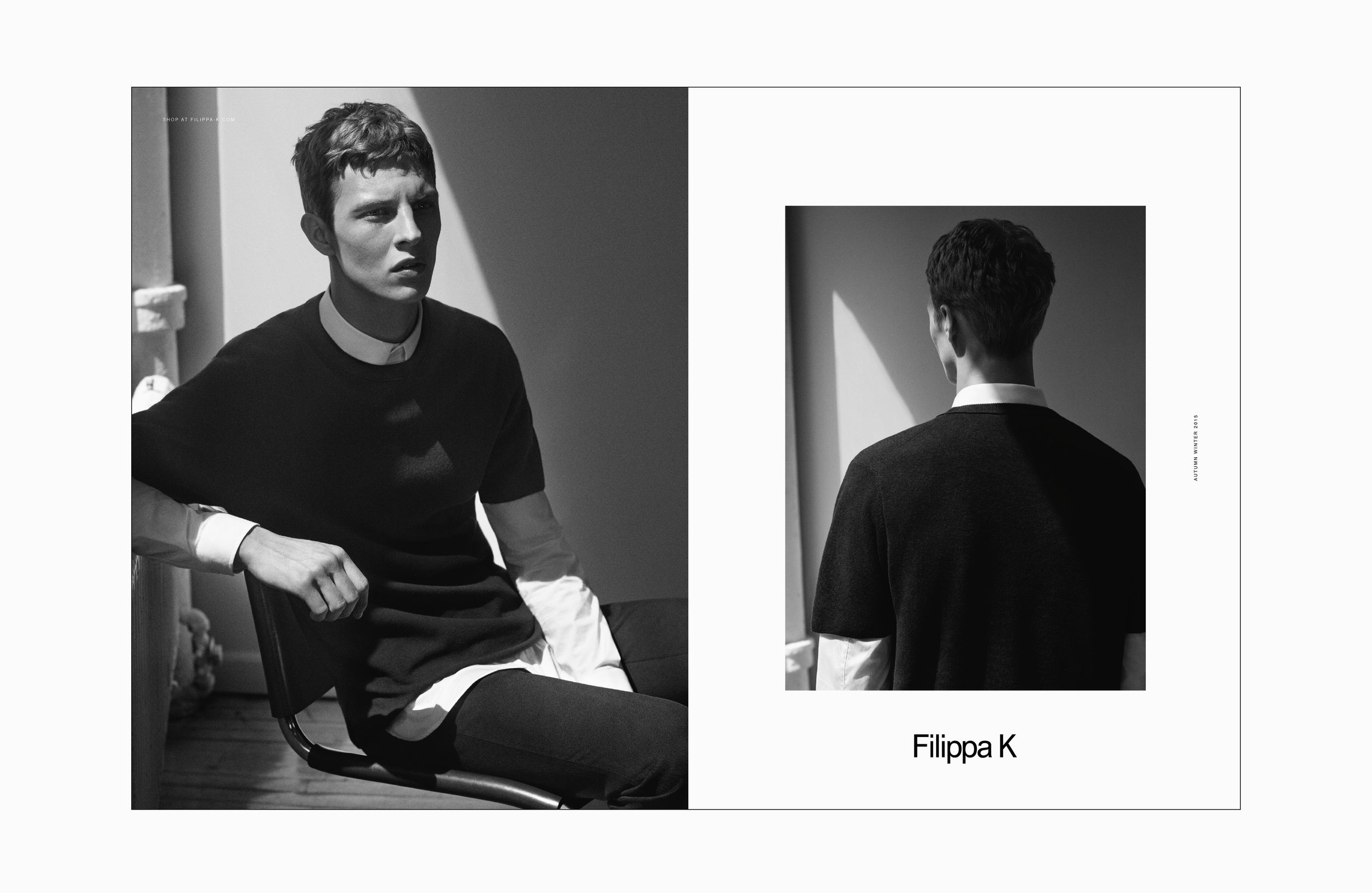
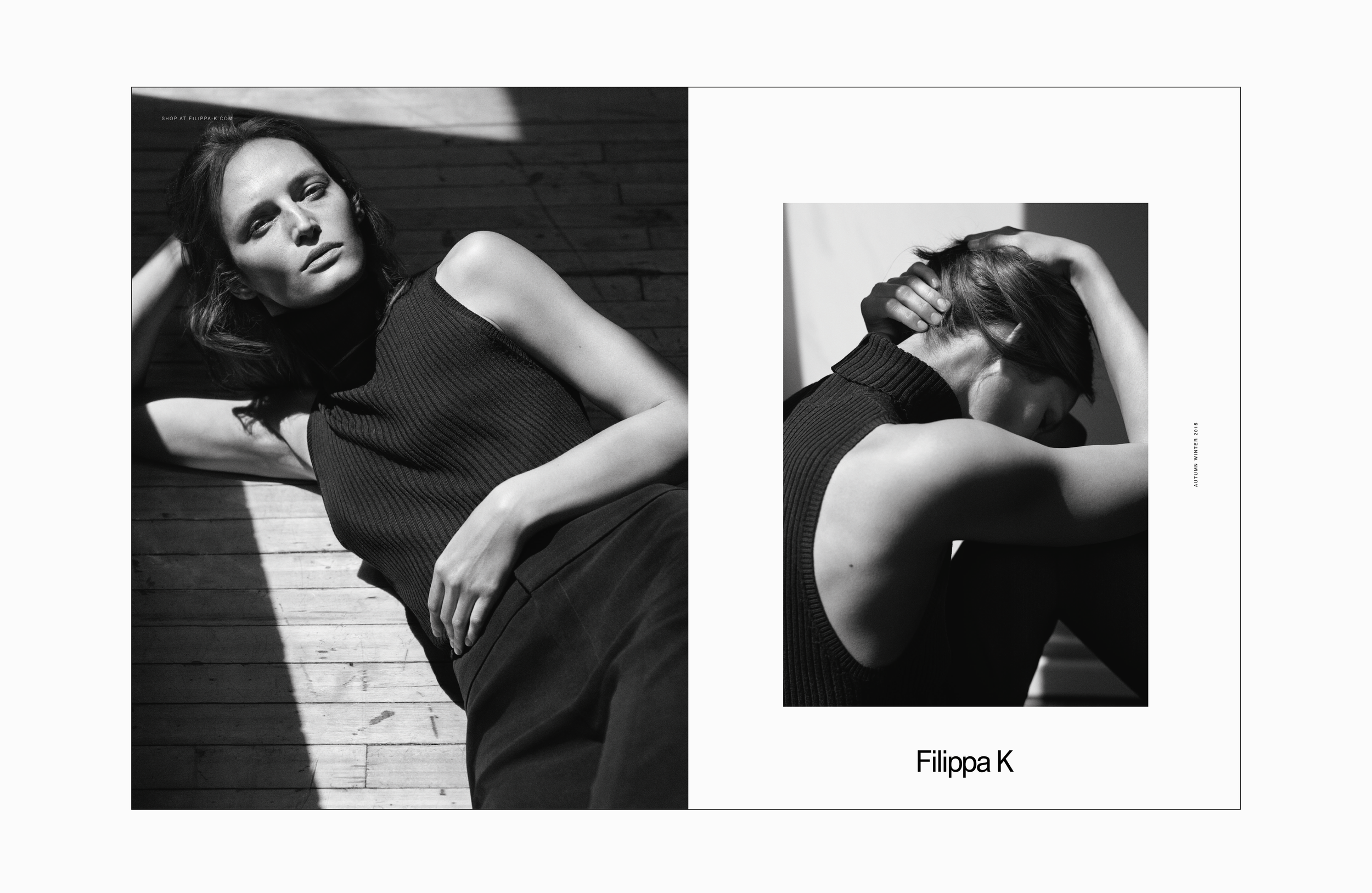
Print campaigns
As a graphic designer, I was responsible for the full process of creating and adapting Filippa K’s print advertisements for high-end fashion magazines. From concept development and layout design to image retouching and preparing print-ready artwork, I ensured every ad reflected the brand’s clean, modern identity. I also managed production and delivery, coordinating with publishers to meet technical requirements and tight deadlines. The campaigns appeared in leading publications such as Vogue, The Gentlewoman, Costume, Styleby, and L’Officiel.
-
Filippa K effectively utilizes print magazine advertising campaigns to reinforce its brand identity and reach its target audience. The brand's minimalist and timeless aesthetic is consistently showcased through carefully curated print advertisements placed in select fashion and lifestyle magazines.
These campaigns often feature high-quality imagery, typically shot in natural settings, and are accompanied by succinct messaging that aligns with Filippa K's commitment to simplicity and quality.
By strategically selecting publications that resonate with its demographic, Filippa K ensures that its print advertisements effectively communicate the brand's values and connect with potential customers.
-
As a graphic designer, I was entrusted with the end-to-end creation and management of print advertising campaigns for Filippa K, specifically tailored for premium fashion and lifestyle publications. My responsibilities encompassed:
Conceptualization: Collaborating with the creative team to define the visual direction of each campaign, ensuring alignment with Filippa K's clean, modern brand identity.
Design & Retouching: Designing impactful layouts and overseeing image retouching to reflect the brand’s refined and minimalist aesthetic.
Prepress & Production: Preparing print-ready artwork, ensuring color accuracy, selecting suitable paper stocks and finishes, and managing quality control in coordination with print vendors.
Campaign Management: Executing detailed media plans, coordinating with magazine publishers, and ensuring that all assets were delivered on time and according to each publication’s technical specifications.
The campaigns were featured in a range of high-profile international and Nordic magazines, including Vogue, L’Officiel, The Gentlewoman, Styleby, Eurowoman, Costume, Damernas Värld, Café, Fantastic Man, and Schön!.